Minimalism and Light: How to Achieve Airiness in Interior Design
Some spaces breathe. Others just exist. The difference isn’t always square footage – it’s light, clarity, and how things don’t compete. Minimalism isn’t about owning less; it’s about feeling more of the space that remains.
A well-designed interior lets light walk in uninvited. It doesn’t shout for attention. It whispers through textures, open forms, and the absence of clutter. When light flows, people relax. That’s the secret.
1. Space Is the New Luxury
Forget objects. Start with emptiness. Every designer knows that space zoning defines how people move, think, even breathe. In minimalist interiors, walls become negotiable – open plans take over, creating continuous visual flow.
Instead of isolating rooms, designers use rhythm: furniture alignment, color breaks, or texture shifts. It’s an architecture of intention, not decoration.
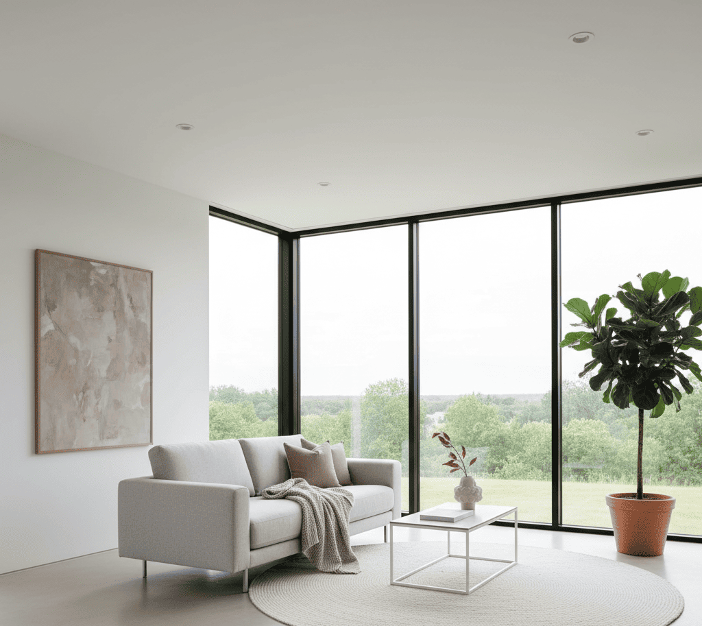
But “space” is more than square meters. It’s how air moves, how eyes travel without interruption, how silence settles. It’s psychological freedom. A cluttered home makes you anxious; a clear one makes you calmer without you realizing why.
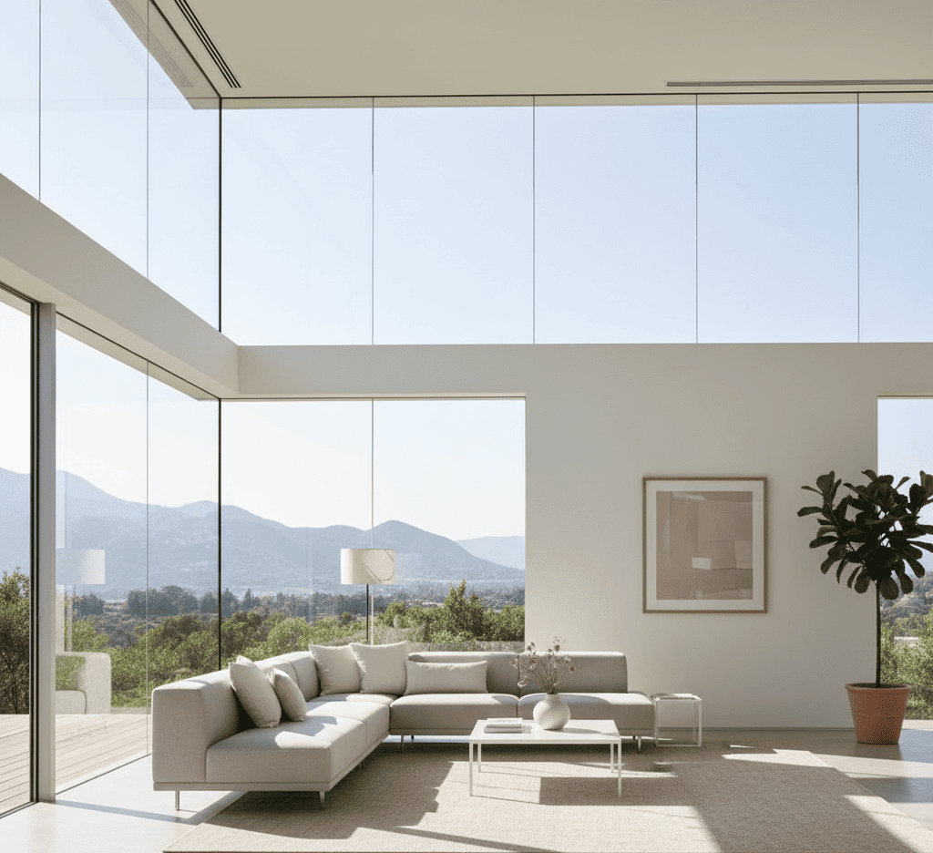
Luxury isn’t marble or brass – it’s the ability to breathe. Designers of high-end homes understand that the real currency of modern living is space that feels unconfined. They use large rugs instead of walls, floating shelves instead of cabinets, and subtle lighting to suggest zones.
A few bold ideas for stylish zoning show how partitions, color contrasts, and modular furniture can define zones without suffocating them. A reading nook can exist inside a living room, a workspace inside a kitchen corner – if the flow is intentional.
If you’ve ever walked into a place where one step changes your mood – that’s zoning done right. It’s not just layout; it’s choreography. Each move is intentional, each pause designed for stillness.
Even small apartments can do this. Slide a sofa a few inches off the wall, align a mirror to double the depth, or leave a corner bare – the room will suddenly feel twice its size.
2. Light as Architecture
Light isn’t decoration. It’s structure. Soft morning rays through sheer curtains, hidden LEDs grazing the ceiling – they build the room. Without them, even the most perfect furniture looks lost.
In many modern interiors, ambient lighting acts as a sculptural element – bending walls, guiding attention, reshaping proportions. Shadows become part of the design language.
A minimalist home doesn’t need chandeliers or drama; it needs a system of quiet accents that trace the form of the space itself.
Sometimes you realize: light is the furniture.
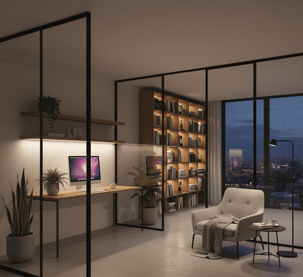
Natural light, in particular, changes everything. It defines time inside the house – how a kitchen glows at 7 a.m., how the living room turns golden at 6 p.m. Designers plan around it like it’s another material. They widen windows, use frosted glass for diffusion, and let reflections bounce between pale walls and glossy surfaces.
Artificial lighting, too, deserves respect. Track lights, warm LED strips under cabinets, wall washers – all of these create rhythm. When used subtly, they turn empty corners into calm sculptures. You don’t see the light source; you feel its temperature, its softness.
Good lighting isn’t expensive. It’s thoughtful. It knows when to vanish.
3. Texture Without Noise
Minimalism is often accused of coldness. But texture saves it. Rough plaster next to polished marble. Linen curtains softening glass. Oak grain balancing concrete. These combinations stop sterility from creeping in.
According to a design essay on modern decor, the secret lies in layering without cluttering. Add visual interest through touch, not color overload. When every surface invites interaction – that’s warmth.
In small apartments, this idea becomes essential. You can’t fill space, so you feel it instead.
4. Subtle Geometry and Silence
Minimalist geometry is ruthless but poetic. Lines meet at deliberate angles; light bounces in controlled rhythms. Look at mid-century design or curved silhouettes from the golden Hollywood era – they prove simplicity doesn’t mean lack of personality.
A good example is maximalist decor reinterpreted through restraint. It sounds contradictory, but the philosophy overlaps: bold forms, simplified. Designers edit, not erase. Remove one thing, and what’s left gains meaning.
Even silence is a shape. You design for it.
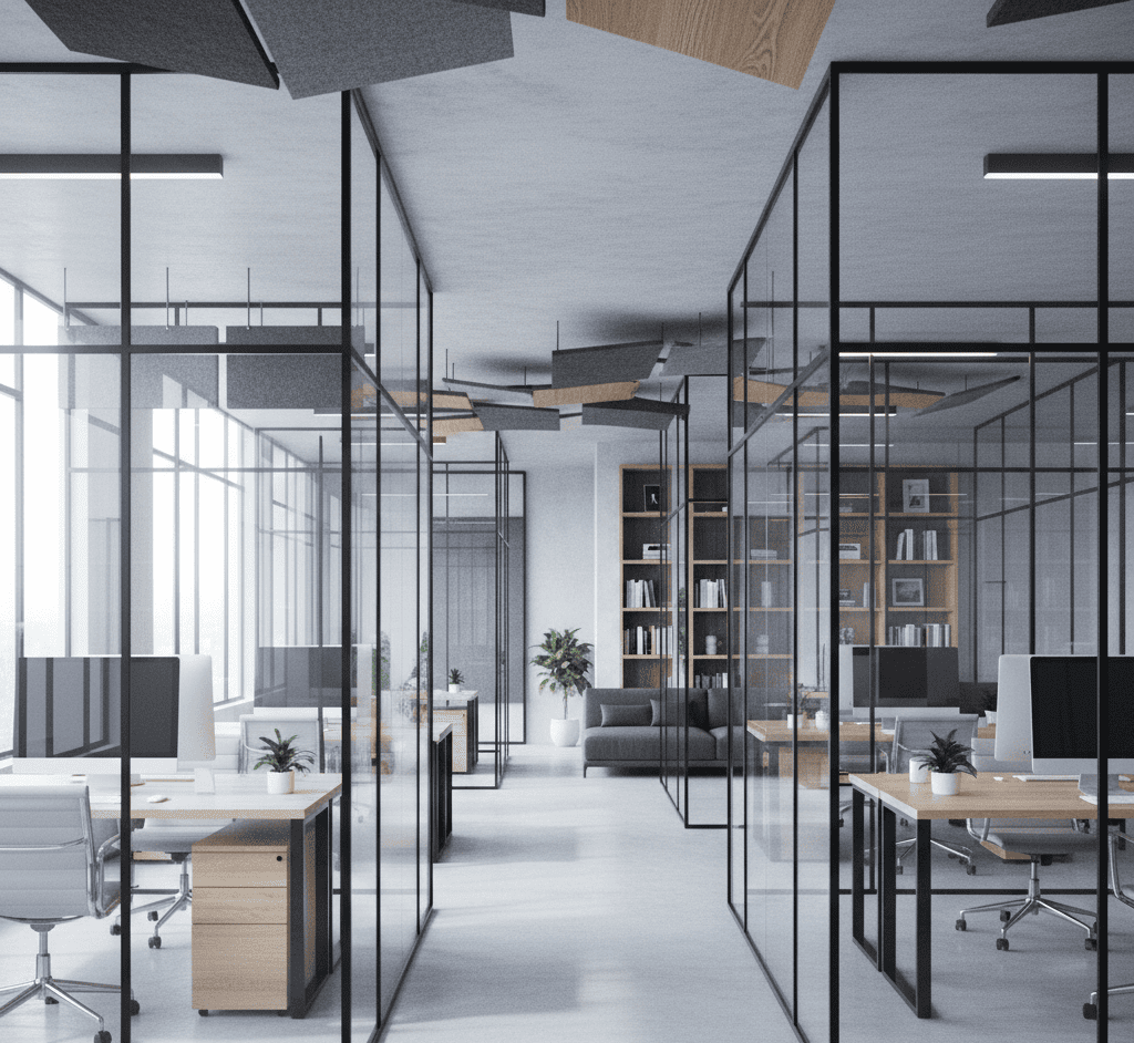
5. The Light Barrier That Isn’t There
Now we come to the trick every architect loves – transparency.
Frameless glass walls – one of the best ways to add lightness and openness to a modern space.
Glass acts like an invisible divider. It keeps privacy yet refuses to block light. It’s how offices stay bright without losing zones, and how homes blend boundaries.
In interior glass solutions, designers call this “transparency with control.” You see depth, reflections, life on the other side. The result feels less like a container and more like a frame for movement.
Pair that with warm flooring and linen drapes – you’ve built a sanctuary, not a showroom.
6. The French Lesson: Imperfection Is Charm
Even the French know – nothing ruins beauty faster than perfection. The so-called No-Rules French style thrives on mismatched chairs, old portraits, wrinkles in linen. Minimalism learns from that chaos.
Real airiness doesn’t come from symmetry. It comes from letting objects have flaws – a chipped edge, a weathered hue, a story. It’s the human fingerprint inside the sterile perfection that keeps the room alive.
In a sunlit room, imperfection glows.
7. Modern Home as a Frame for Life
The ultimate minimalist goal isn’t design – it’s presence. When walls fade, your senses expand. You hear the city outside, you see daylight slide across your desk. You stop looking at things and start noticing the in-between.
Minimalism gives room for silence, for slow mornings, for coffee steam caught in the window. Maybe that’s what airiness really means – space to notice what’s already there.
And when the sun sets, all those “invisible” design choices – the spacing, the textures, the way light hugs a wall – start working quietly again. They don’t ask for gratitude. They just stay, glowing softly in the background.
A modern home should never feel like a museum. It should adapt, host, and breathe. A room is alive when it’s incomplete – when you can still imagine something changing tomorrow. The emptiness isn’t loneliness; it’s anticipation.
Even top interior designers agree that a home should evolve, not ossify. Design isn’t a one-time act – it’s a dialogue between light, materials, and the people who live inside it. The most successful minimalist spaces don’t end; they just keep becoming.
And yes, airiness has sound. It’s the echo of your own footsteps on wood floors, the faint hum of wind sneaking through an open balcony, the rustle of linen when someone passes by. These are the invisible threads that tie minimalism to memory.
In the end, a truly light interior is not a style. It’s a rhythm between you and your surroundings – calm, patient, real.

FAQ
1. How can I make my apartment feel more open without major renovation?
Use transparent partitions, lighter colors, and avoid heavy furniture. Let natural light define the layout.
2. What colors work best for a light minimalist interior?
Soft neutrals, warm whites, muted greys, and occasional earthy tones – they reflect light beautifully without feeling cold.
3. Are frameless glass walls safe for homes?
Yes. Modern frameless systems use tempered glass and solid hardware, providing safety while maintaining visual lightness.
4. How do I prevent minimalism from feeling sterile?
Add texture, organic materials, and small imperfections – they bring warmth and personality into clean spaces.